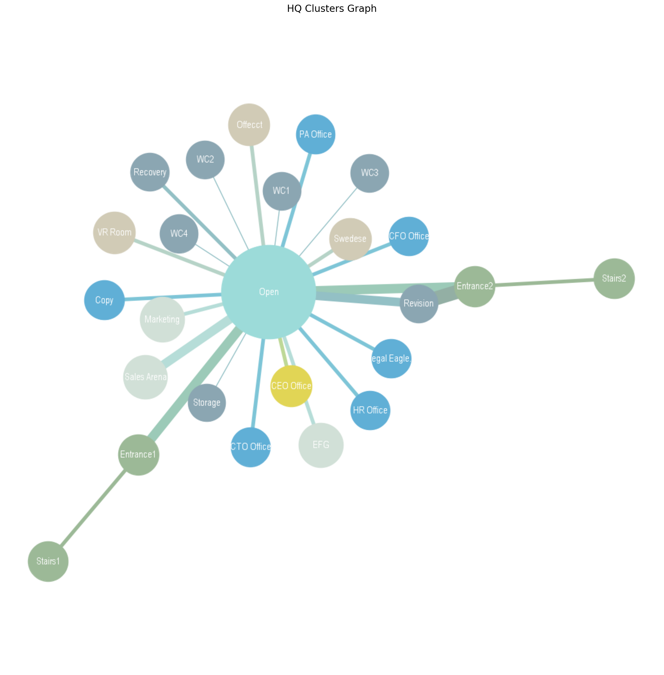
Room Graph
During the past few years, I have been responsible for the room-list and the door-list in the planning of a large biotechnology facility. It suddenly occurred to me that these two things are actually one and can be jointly represented by a graph.
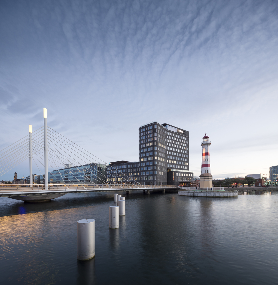
For obvious confidentiality reasons and also for the sake of clarity, I will not publish that. Although free access to structured architectural data, aka BIM, is very restricted, there are some exceptions. BIMobject®, a digital platform for the construction industry based in Malmö, Denmark, is one of them. They actually published the model of their own headquarters designed by SHL Architects as a demonstration of best practice.
Studio Malmö by SHL
# https://www.bimobject.com/de-ch/bimobjectmodels/product/bimobject_hq
img = mpimg.imread('data/layout.jpg')
fig = plt.figure(figsize=(30,10))
ax = fig.add_subplot(1, 1, 1)
ax.imshow(img, interpolation='bilinear')
ax.axis('off')
ax.set_title('BIMobject HQ', fontsize=16);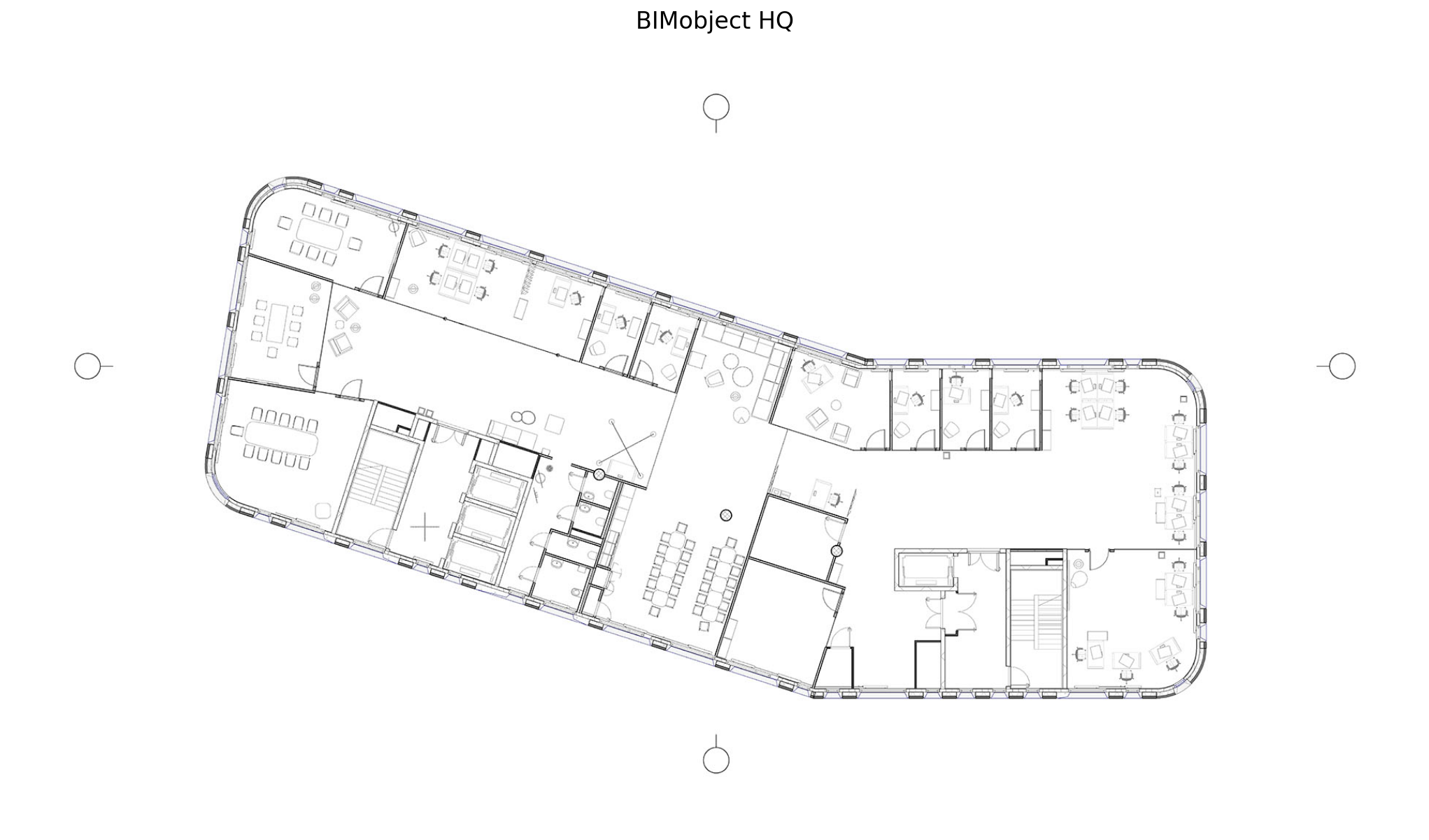
Networked Rooms
The idea, which is frankly not new but also not common practice in the industry, is to represent rooms and doors as nodes and edges of a network. Room properties such as area and perimeter become node_attributes and door properties such as width and height become edge_weights.
Get structured data
# Load rooms
rooms = pd.read_csv('data/room_schedule.csv', skiprows=[2], keep_default_na=False)
rooms.columns = rooms.iloc[0]
rooms.drop([0], inplace=True)
rooms['Area'] = rooms['Area'].map(lambda x: x.rstrip(' m²'))| Name | Area |
|---|---|
| CTO Office | 9.52 |
| Legal Eagle Office | 9.51 |
| PA Office | 9.51 |
| CEO Office | 21.62 |
| HR Office | 9.30 |
# Load doors
doors = pd.read_csv('data/door_schedule.csv', skiprows=[2], keep_default_na=False)
doors.columns = doors.iloc[0]
doors.drop([0], inplace=True)
doors.drop(doors.tail(1).index, inplace=True)| From Room | To Room | Width |
|---|---|---|
| CTO Office | Open | 1015 |
| Legal Eagle Office | Open | 1015 |
| PA Office | Open | 1015 |
| CEO Office | Open | 1015 |
| CFO Office | Open | 1015 |
Preprocessing rooms
ra = np.array(rooms['Area']).astype(float)
rp = np.array(rooms['Perimeter']).astype(int)
Preprocessing doors
dw = np.array(doors['Width']).astype(int)
dh = np.array(doors['Height']).astype(int)
# Calculate normalized area of door openings
bond = dw*dh
bond = bond/bond.max()Graph construction
Now it is time to build the network. The graph is small and should be easy to construct but there is a problem. ‘Open’ and ‘Sales Arena’ are connected with 2 doors. A double edge or Multi-edge is allowed but hinders calculations and for all intends and purposes can be replaced by a weight.
fr = np.array(doors['From Room'])
to = np.array(doors['To Room'])
pairs = np.vstack((fr, to)).T
import warnings
warnings.filterwarnings('ignore')
# Create a networkx MultiGraph object
G = nx.MultiGraph()
# Add edges to to the graph object
# Each tuple represents an edge between two nodes
G.add_edges_from(pairs[:, [0, 1]])
c = np.array(G.edges).T[2].astype(int)
my_pos = nx.spring_layout(G, seed=56)
# Draw the resulting graph
nx.draw(G, pos=my_pos, with_labels=True, edge_color=c, width=1.5, node_size=4, edge_cmap=plt.cm.Paired)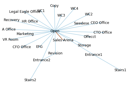
Embed Attributes
At the moment our MulitiGraph is not attributed. It needs to be converted into a simple weighted Graph with embedded node attributes.
weight = 0
nx.set_edge_attributes(G, weight, 'weight')
for i, pair in enumerate(pairs):
G.edges[(pair[0], pair[1], pair[2])]['weight'] = bond[i]# Weighted Graph N from MultiGraph G
N = nx.Graph()
for u,v,data in G.edges(data=True):
w = data['weight'] if 'weight' in data else 1.0
if N.has_edge(u,v):
N[u][v]['weight'] += w
else:
N.add_edge(u, v, weight=w)for i, node in enumerate(rooms['Name']):
N.nodes[node]['area'] = ra[i]The Graph rendered as a Matrix
# Graph to matrix
A = nx.to_numpy_matrix(N)
plt.figure(figsize=(15,8))
plt.title('Adjacency matrix')
sns.heatmap(A, cmap=plt.cm.Paired, annot=True, xticklabels=N.nodes, yticklabels=N.nodes);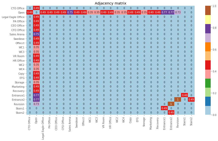
Gephi Export
Why is a graph useful in the first place? Because it is operational, not just a visualization. It can provide us with network-specific metrics that add to the dimensionality of the initial dataset. For a first evaluation, Gephi, an open-source graph-editing software, is a good option.
with open('data/room_graph.graphml', 'wb') as ofile:
    nx.write_graphml(N, ofile)
Get data laboratory results
# Load data from Gephi
data = pd.read_csv('data/data_lab.csv')
data = data.rename(columns={'d0': 'area'})
columns = ['Id', 'timeset', 'componentnumber']
data.drop(columns, inplace=True, axis=1)| Label | eigencentrality |
|---|---|
| CTO Office | 0.209728 |
| Open | 1.000000 |
| Legal Eagle Office | 0.209728 |
| PA Office | 0.209728 |
| CEO Office | 0.209728 |
This method effectively expands the dataset from two to fourteen dimensions.
labels = np.array(data['Label'])
X = np.array(data.drop(['Label'], axis=1))
X.shape
(25, 14)
Clustering
Our data are sparse to begin with and clustering in high dimensions is destined to fail. In order to escape the curse-of-dimensionality, an intermediate mapping is needed.
Step 1: Non-linear dimensionality reduction.
# Apply isomap with k = 24 and output dimension = 3
from sklearn.manifold import Isomap
model = Isomap(n_components=3, n_neighbors=24)
proj = model.fit_transform(X)
Step 2: Kmeans clustering in 3 dimensions.
# Apply deterministic KMeans with n_clusters = 7
from sklearn.cluster import KMeans
Kmean = KMeans(n_clusters=7, random_state=13)
Kmean.fit(proj)
# Plot clustered isomap
fig = plt.figure(figsize=(14,10))
ax = fig.add_subplot(1, 1, 1)
ax.scatter(proj[:, 0], proj[:, 1], cmap=cmap, c=clusters, s=140, lw=0, alpha=1);
# Remove the top and right axes from the data plot
ax.spines['right'].set_visible(False)
ax.spines['top'].set_visible(False)
ax.set_title('Kmeans clustering on projected data', fontsize=16);
for i, m in enumerate(match):
ax.text(proj[i, 0]+0.07, proj[i, 1]+0.07, m[-1], fontsize=12)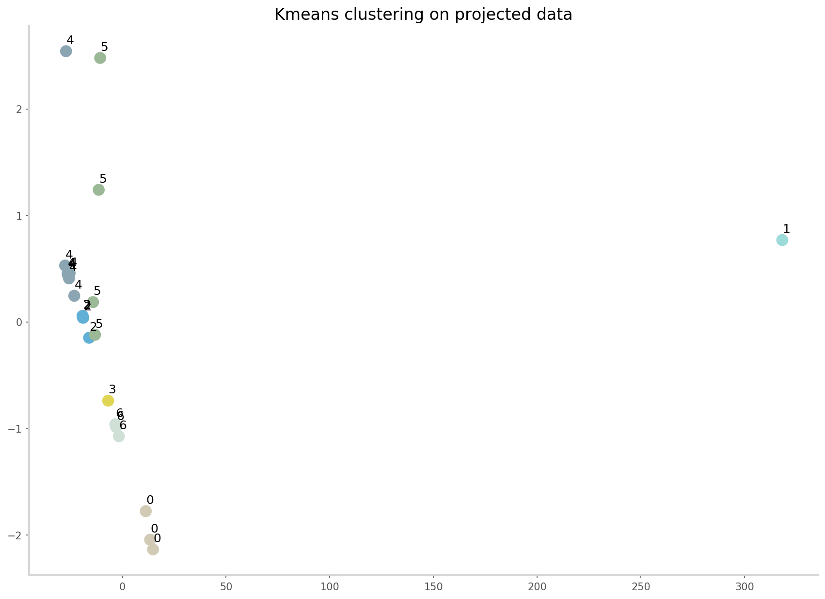
The algorithm successfully identifies meaningful room clusters.
img = mpimg.imread('data/clusters.jpg')
fig = plt.figure(figsize = (30,10))
ax = fig.add_subplot(1, 1, 1)
ax.imshow(img, interpolation='bilinear')
ax.axis('off')
ax.set_title('HQ Clusters', fontsize=16);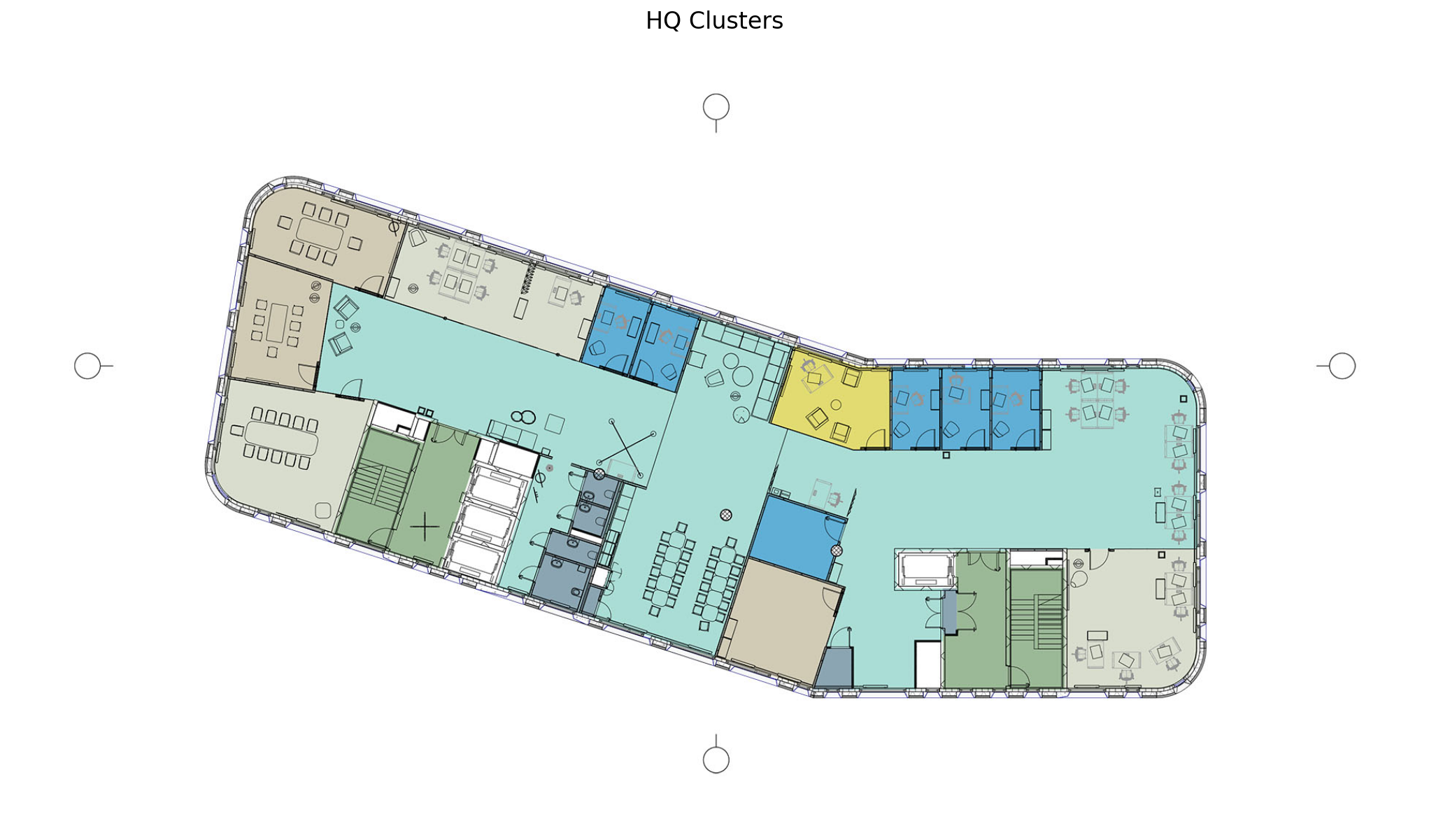
Check out the Jupyter notebook for the full code.